→ Personal project built in 4 weeks. I designed 100% of the product. My partner built the constraint solver in FastAPI; I ported the design to production React.
My partner and I cook together most nights. We have different goals: they track protein, I track calories. We eat the same dish. Every week we'd make the same five recipes and neither of us hit our targets. Restaurants solve this with a fixed menu.
The actual problem is simultaneous optimization. Not just plan meals. Find seven dinners that hit two different people's macro targets at once, using the same ingredients. A standard meal planner works for one person. This needed to work for both.
I built a constraint solver in FastAPI that chooses recipes and then calculates portions per person so weekly targets land exactly. Then I had to design a UI that made the whole thing legible.
Solver shipped in two weeks. Remaining two weeks: pure design. The UI worked but felt like a database tool. No onboarding. Navigation was tabs for database tables, not user tasks.
First version was just code: raw React components, no visual language, generic inputs and buttons. It worked, but it didn't look like a product. No onboarding. Users had to create households and members by hand.
The prototype had tabs for Meals, Members, Recipes, Settings. That's database structure, not how people think. Real users navigate by what they're doing: Plan this week. Shop. Look up a recipe. Manage the household.
The solver is non-negotiable. Weekly targets are the contract. I can't hide failures or override its logic. When it can't find a plan, I have to translate that into human language with a next step.
Started building directly in React with basic components. Once the solver worked, I jumped into Figma to structure the flow, explore visual directions, and create a coherent language. Moved sections around, reorganized navigation from database tabs to task-focused flow, and iterated on aesthetics. Then ported everything back to production React.
Reorganized navigation around what users actually do. Home shows the weekly plan. From there: change a meal, mark eaten, add external meal, or regenerate the plan. Shopping list and recipes are one tap away. Empty states guide the next action. No household? Start here.
Explored three directions in Figma: navy + apricot (too corporate), minimalist fintech (too cold for cooking), warm beige (every AI startup uses it). Landed on sage green + pink with a white base. Removed black from screens. It felt heavy. Typography: Bricolage Grotesque (bold, tight) for headlines and brand voice. DM Sans for body.
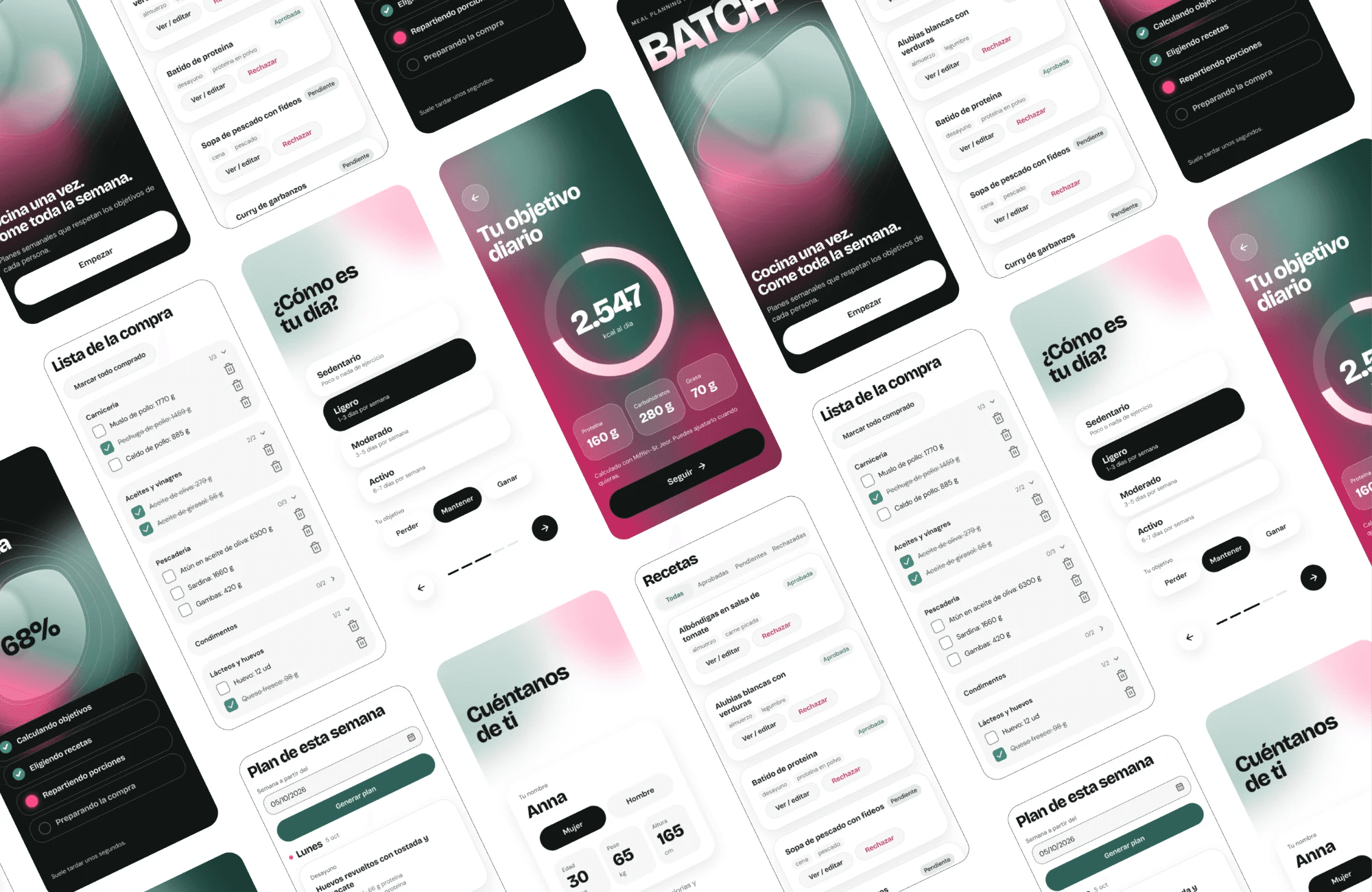
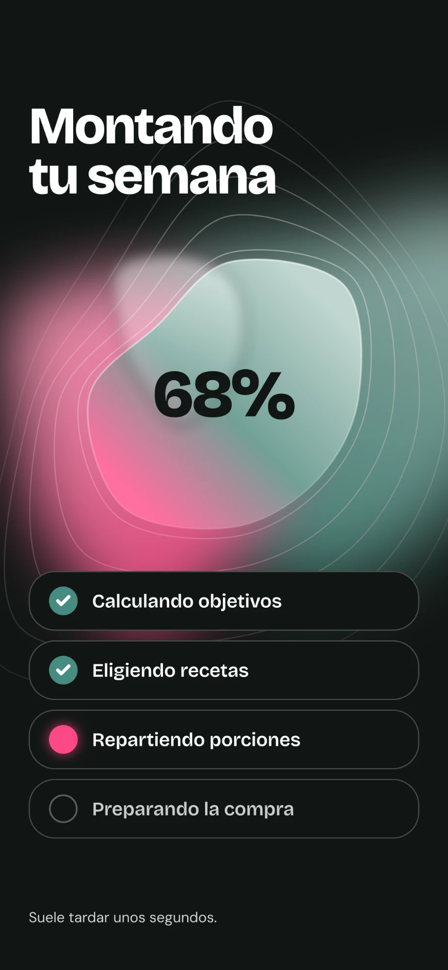
Built mobile-first (7 screens): Welcome → Home → You (macros) → Your day (activity level) → Reveal (daily breakdown) → Add people → Building week (narrated solver steps). Household creates lazily. First plan generates at onboarding's end. Users land in a real plan, not an empty dashboard.
Every solver error (infeasible, missing API key, timeout) gets translated. Cannot satisfy constraints at 1800 kcal/day becomes Can't meet your targets with these recipes. Try wider targets or add more recipes, with a direct link to adjust. No stack traces shown to users.

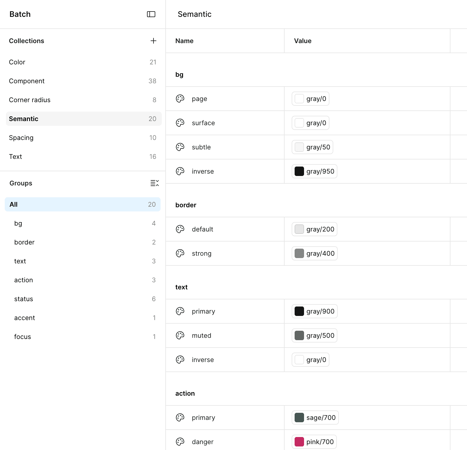
Primitives (11 colors) → Semantic tokens (text-primary, surface-card, etc.) → Component tokens. Built in Figma with variables, synced to CSS custom properties. No handoff. I ported it myself from Figma to React, so every token cascades correctly.

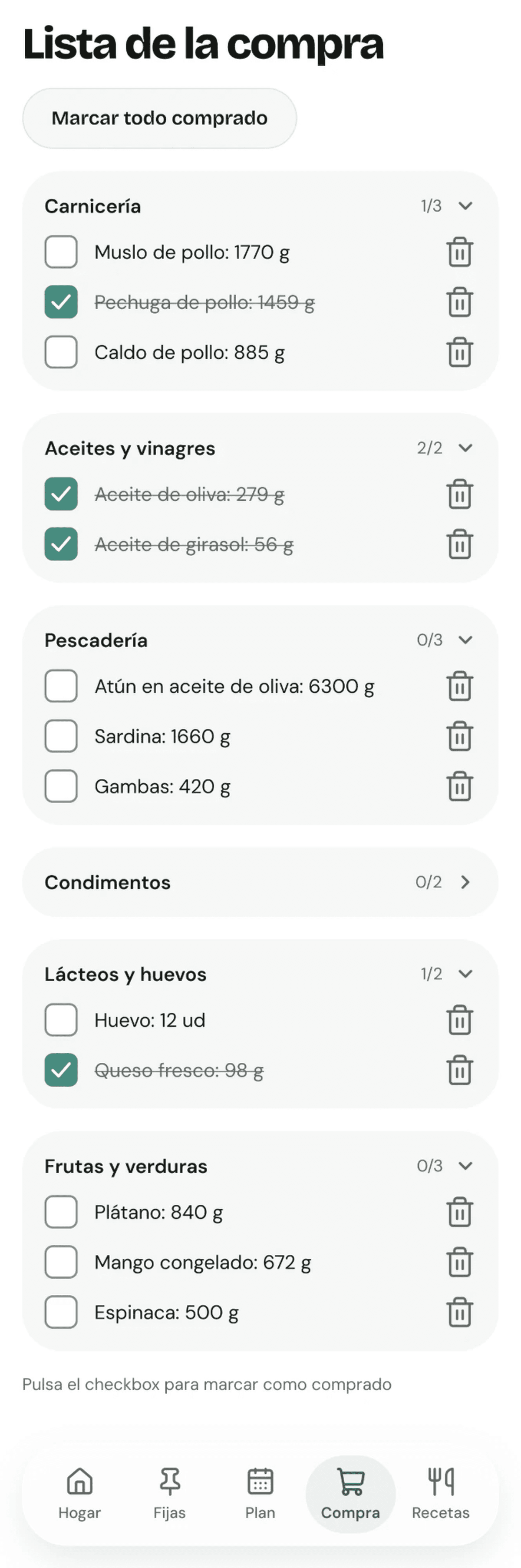
Grouped by semantic category (Produce, Meat, Oils, Dairy, etc.) instead of which meal needs what. Collapsible sections with progress tracking. Checkboxes toggle items to struck-through so users feel progress as they shop.

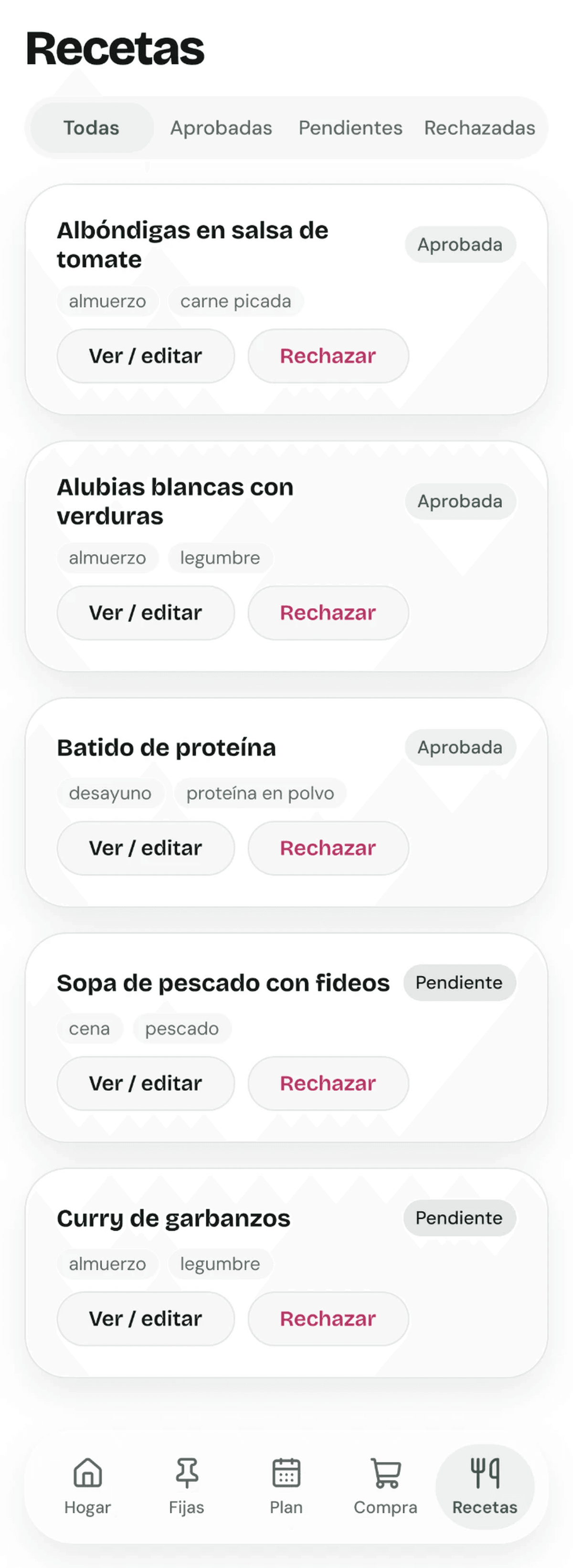
Browse all recipes and mark as liked, pending, or rejected. Liked recipes lock into future plans. Rejected ones get removed. Gives users control over which dishes come back, which keeps the solver interesting instead of repetitive.

Every contrast decision is verified. Muted text hits 4.67:1 on white (exceeds AA). Control borders hit exactly 3.5:1 (AA minimum). Focus rings are 2px sage green with 2px offset, visible without being distracting. Touch targets are 24px minimum so people can tap on mobile without frustration. Form semantics use fieldset + legend for radiogroups instead of bolting roles onto generic divs. Animations respect prefers-reduced-motion (morphing blobs fade instead of animate). Verified with axe-core on every screen at mobile and desktop.
Personal use case stressed every decision immediately. No research phase, no we'll test it later. I live with this product. Every flow, every button, every error message gets tested the night I ship it.
Built in React first, then Figma for structure and aesthetics, then back to React for production. Learned that jumping between code and design is messy but forces you to think about what's actually buildable.
The solver is the design. The UI doesn't fight it or hide it. It translates constraint programming into human language.
Starting in React with a basic UI gave us a real product to iterate on. Jumping to Figma wasn't about starting over. It was about finding the language and structure. Then porting back to code ensured every Figma decision was actually buildable.
Users don't trust what they don't understand. The morphing blobs and narrated solver steps aren't decoration. They explain how the product works before you use it.
I can make decisions fast because I'm the user. No stakeholder alignment, no research cycles. That's liberating and limiting. It works for us two, but I'd need data before claiming it scales beyond a household.