Selected Screens
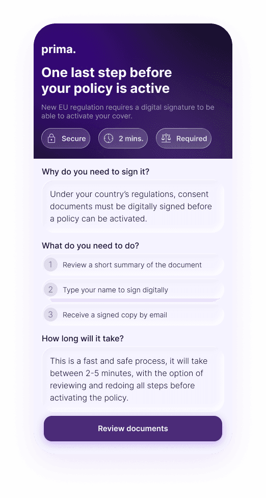
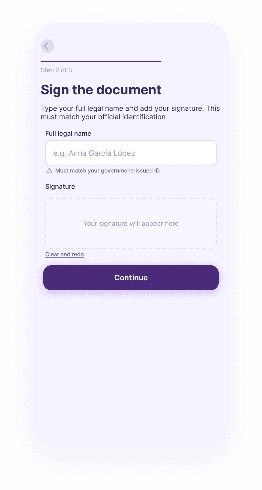
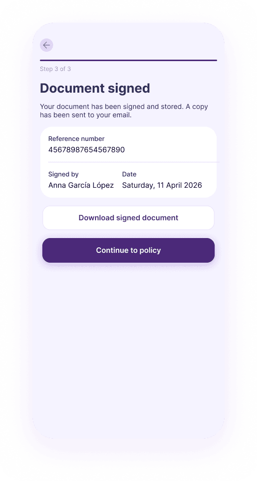
→ 72h to deliver the full flow across mobile and desktop, with an eIDAS-compliant audit trail
New EU regulation was coming. A fintech company needed to add a mandatory digital signature step to an existing insurance conversion flow, without killing the conversion rate.
The brief was open: design a clear, low-friction flow that helps users understand what they are signing while keeping drop-off as low as possible. Deliverables included a user flow, detailed mockups, and any supporting documentation. No prescribed structure, no template to follow.
I completed the challenge in 72 hours, covering the full flow from the moment a user reaches the signature step through to confirmed completion, across both mobile and desktop.
Users arrive mid-purchase and are asked to sign a document they haven't read. The UI has to lead with why before it asks for the signature.
Combining document review and signature capture on one mobile screen gets cluttered fast. Every step needs a single clear action.
The flow has to satisfy eIDAS SES requirements without feeling like a legal form. Compliance has to stay invisible to the user.
Mapped regulatory requirements (eIDAS SES) against the conversion journey to identify where trust typically breaks down.
Applied a compliance flow structure developed during Verifactu work: legal basis upfront → document access → explicit consent → proof returned.
Designed the full gate → review → sign → confirm → success sequence for both mobile and desktop.
Justified each layout and interaction choice against legal requirements and UX rationale.
Built complete mobile and desktop screens with distinct layout approaches for each breakpoint.
Delivered in 72 hours as a take-home design challenge. The brief asked for a clear, low-friction flow, no prescribed format, no template. The response covers the complete journey.
Every screen does two jobs at once: move the user forward, and add to the compliance audit trail. Gate, document review, signature capture, confirmation, success: each one maps to a step in the legal record.
I reused a regulatory UX pattern from Verifactu work at NetSuite: legal basis upfront, transparent document access, explicit consent, proof returned. Same structure, just applied to a consumer fintech flow.
Lead with the legal reason, not the form. Users who understand why they're signing drop off less.
Typed name plus checkbox is legally valid under eIDAS SES. It's lower friction than drawing, and a live preview still makes it feel real.
Every screen (gate, review, sign, confirm, success) contributes to the compliance record, not just the happy path.
Separating review from signature capture on mobile keeps cognitive load low and the UI clean.